Monthly 2026, 02 - Font Design with FontStruct
I need a few fonts for other projects, namely for the pen and paper systems I've been writing. I've predictably made them on the markdown software I've been using, but eventually these need to be turned into PDFs, and once something is squeezed into that format, it'd better look like the thing it's supposed to be. Technically the first system I attempted is still unfinished to the point that I don't really feel like putting a lot of energy into the cosmetics, but the second one is more or less mechanically complete, if not balanced to completion. Still, I can think about creating the font for the thing as it is now, and perhaps I'll manage to balance the stuff in the system so that it's playable.
The setting is post-apocalyptic lovecraftian horror, with many factions claiming domains of what remains of their old world to harness their newfound power for themselves. I'm debating with myself how I'd want to symbolize that. I'm imagining either some scratchy or something inky, if that makes sense. I don't believe the two will make much sense together, so for headlines and the like, I'll have to make a different set, but first I would like to find a tool that looks like it'll give me what I need.
There's several tools that will output a .tff file in the end, which I think should be all I need in earnest, but many of them have other limitations. Fontstruct, I think looks like as close to an open-source option as I can find quickly, so I'd like to use that first.
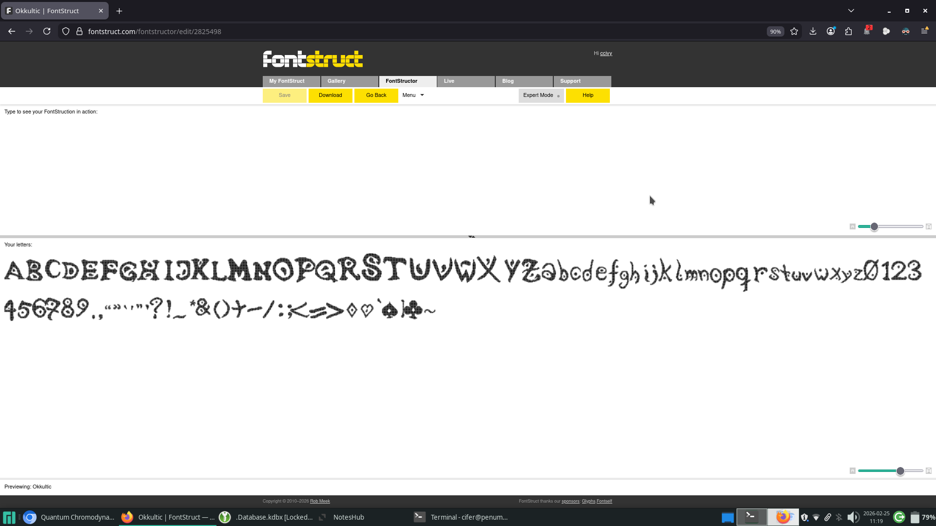
Fontstruct is pretty easy to use at first glance. It presents you with a grid at which to draw each letter. I had to turn off my dark-reader, because it made reading the interface impossible, which also makes me hope that the fonstruct fonts can adjust to color settings in whatever I decide to assemble the pdf in. It's also very definitively a mouse-interface. I tried for a while there with my trackpad, but everything took so long, I had to go and find a mouse to not go insane. I made a good chunk of the capital letters for the first session, which is probably good progress. Considering what I'll use the font for, I'll need at least the alpha-numerals, and a significant chunk of grammatical symbols, but I can probably go without most of the special symbols. Perhaps I'll need the ampersand, because I'm partial to using it, but I might get away with skipping $, @, and %, for example. I might also get around most of the brackets. This is interesting to this use specifically, because there's some ascii-symbols that will make an appearance in the document, so I might just draw those over the square and curly braces. I'll have a think about it, when I'm mostly done with the font.
I'm guessing the best use-case for this process might be a drawing tablet, or touch-screen based input method of some kind, because I'm getting the feeling that I'm crushing my mouse as I do all that dragging the cursor around. It's made me take breaks in between creating the letters, and not primarily because I felt bored for the day and wanted to give it a rest, but rather because I felt a slight pain in my wrist. On a good note though, one does get a lot faster as time goes on, and when alternating between the kinds of strokes one performs by selecting which characters to work on, one can make fast progress. The capital letters probably took me the longest. I did three sessions of font-drawing in total, and while I got mostly through the capitals in the second session, I did most of the rest in the second, before I got bored. The third session was really just five or so characters, and then going back to make a brief sweep of corrections. Fontstruct has the option for a .ttf download, so I didn't have to fight it on getting my preferred font-format, which is only as such, because I technically know how to install it already. After that, comes the second interesting part: Making the .pdf print text in that font.
I don't want to export the text out of markdown anyway, so I might as well move it directly into some magazine-designer. I figure that since I'm going to be working with illustrations as well (though not mine, I'm not that confident), I might as well put it into a software that can do that as well. I'm thinking about Scribus, since that one works on Linux systems and is open-source. One can probably make a case for something like Adobe InDesign, but I'm not going to start shilling out money to a company I otherwise barely respect, just to try around for some stuff.
Installing fonts in Scribus is pretty easy, and barely worth diving into. Suffice to say, that it's very easily findable in the options, and I didn't run into any problems doing it. The font I made does of course run into the ever-present problem of bad kerning, which I'm perhaps not willing to fix, considering it doesn't go terribly with the setting that the rulebook is supposed to be attached to. For this month, that concludes my experimenting. I would probably recommend Fontstruct as a tool, if anyone wanted to try their hand at creating a font, and whether I like Scribus will remain to be seen, once I'm further along in this particular project.
I'm not sure who would want to use this, bad kerning and all, but I'll attach the font file anyway.